21 Gallery Wall Ideas That Never Look Cluttered
Transform any blank wall into a stylish focal point with these 21 gallery wall ideas that feel curated, balanced, and beautifully organized. From modern symmetrical layouts and oversized statement frames to layered artwork, family photos, and designer-inspired arrangements, these ideas help you create visual interest without overwhelming the space. Whether you’re decorating a living room, hallway, bedroom, or home office, you’ll find timeless gallery wall inspiration that adds personality, depth, and a polished high-end look while keeping your home feeling clean, cohesive, and clutter-free.
Oversized Minimal Trio Alignment Wall
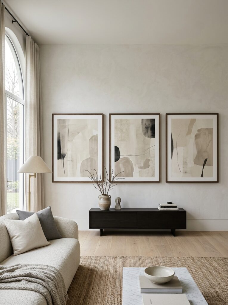
Three oversized framed artworks arranged with equal spacing create a powerful minimalist gallery wall. The large scale reduces visual clutter while increasing impact. Neutral abstract prints in beige, black, and soft gray keep the composition calm and cohesive. This design works because fewer, larger pieces always feel more intentional than many small ones. The spacing becomes part of the design, allowing negative space to define elegance and sophistication.
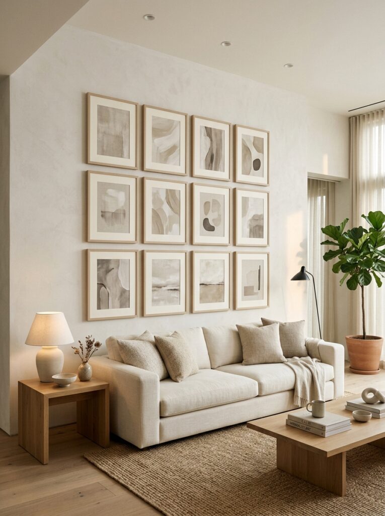
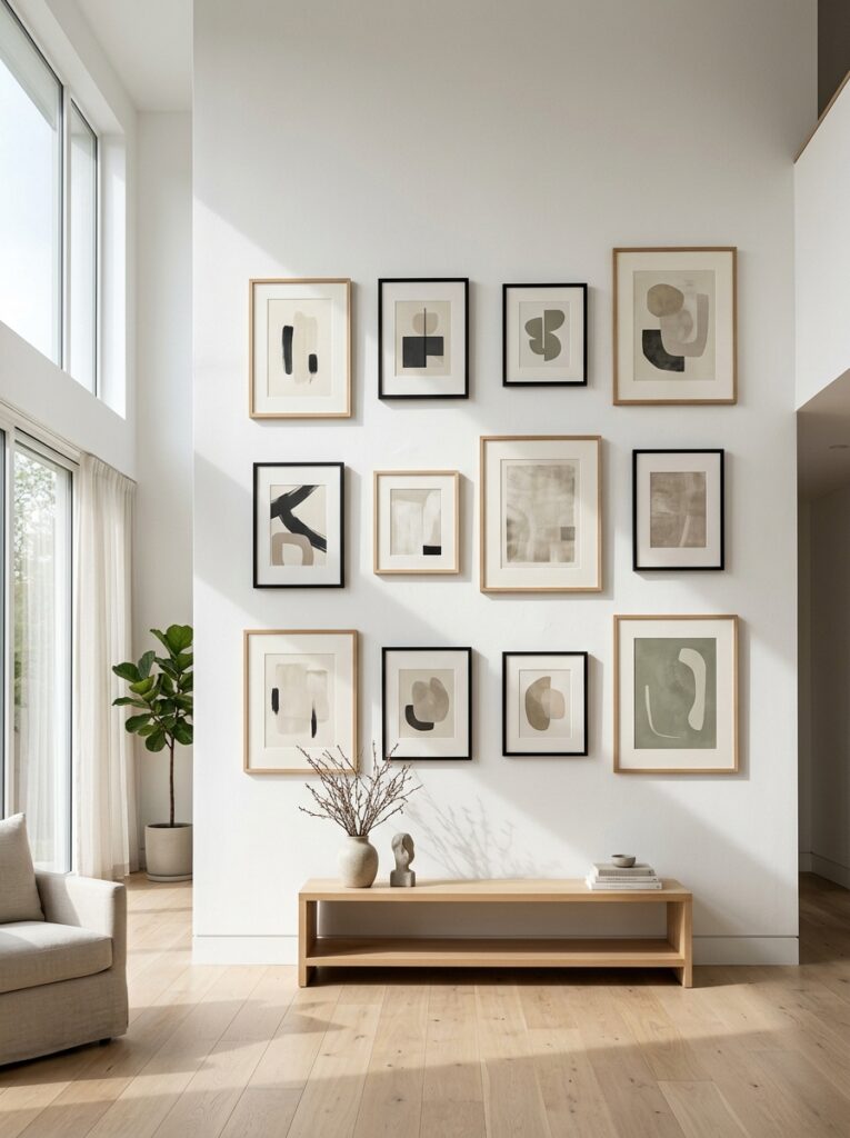
Symmetrical Grid Gallery Wall
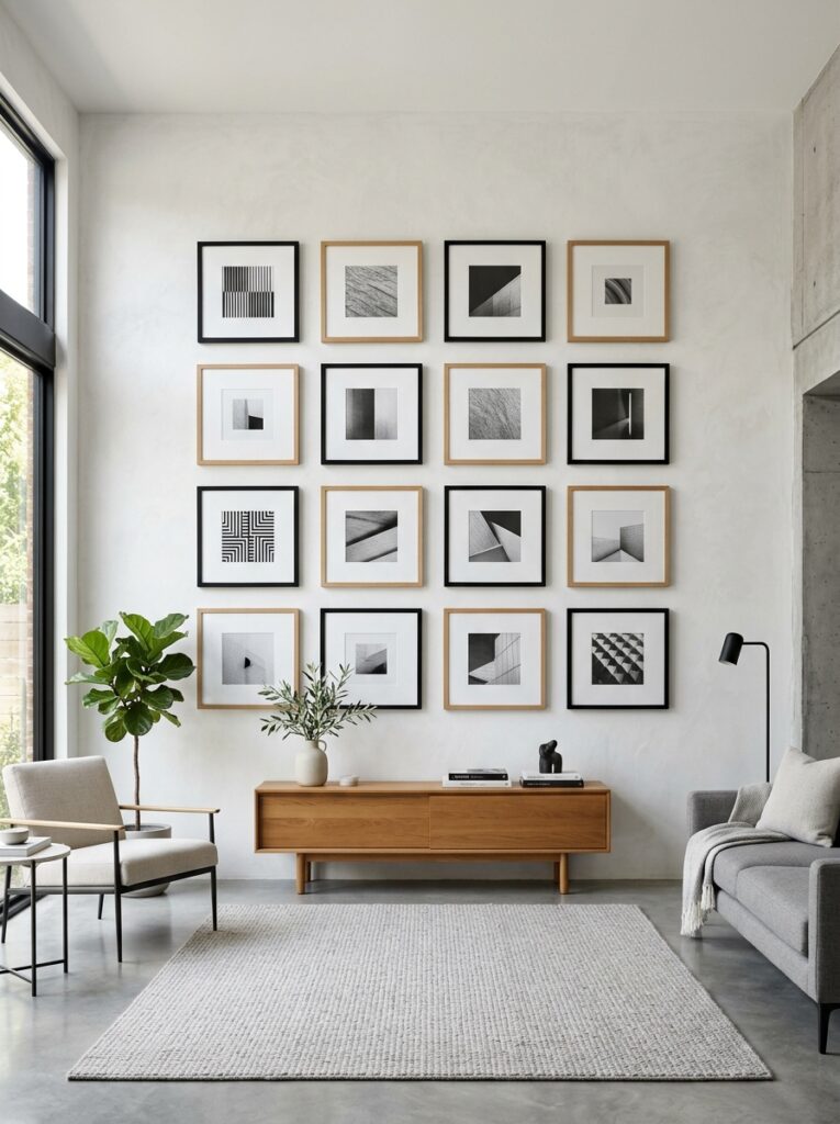
A symmetrical grid layout creates order and structure in a gallery wall. Identical frame sizes and equal spacing eliminate chaos instantly. Black or oak frames over white walls enhance contrast without overwhelming the eye. This design feels timeless because symmetry naturally signals balance and control in interior design.
Floating Shelf Layered Art Wall
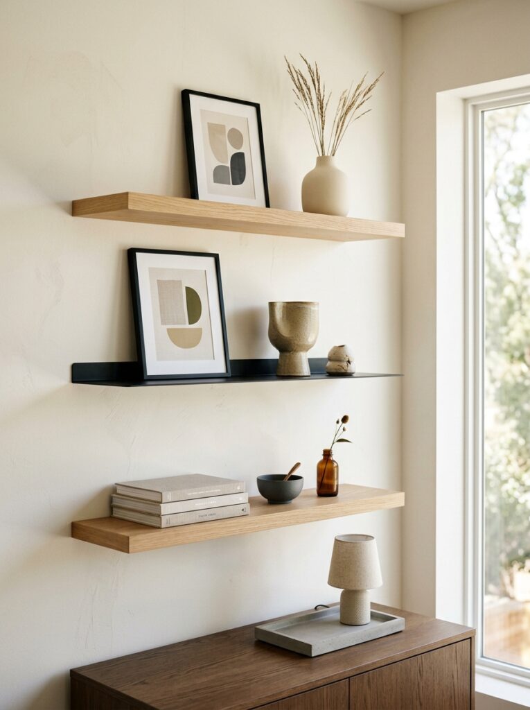
Floating shelves allow layered art display without drilling multiple frame positions. Frames lean casually against the wall while decor objects break repetition. The trick is restraint—only a few curated pieces per shelf. This design feels curated rather than cluttered because everything has breathing space.
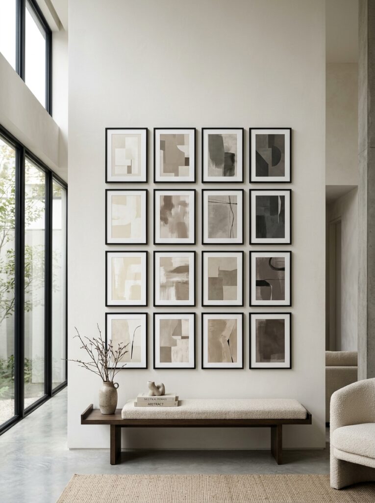
Black Frame Monochrome Gallery Wall
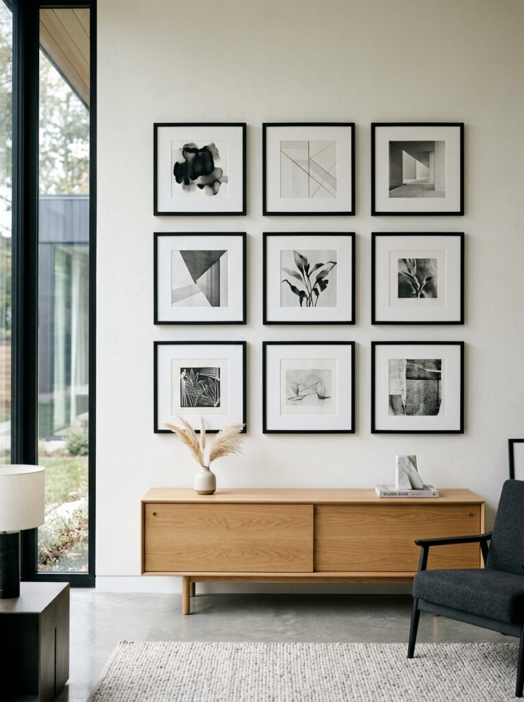
A monochrome gallery wall using only black frames and grayscale artwork creates strong visual unity. The consistent palette removes distraction while maintaining structure. This design works because repetition builds rhythm, making even dense arrangements feel controlled and intentional.
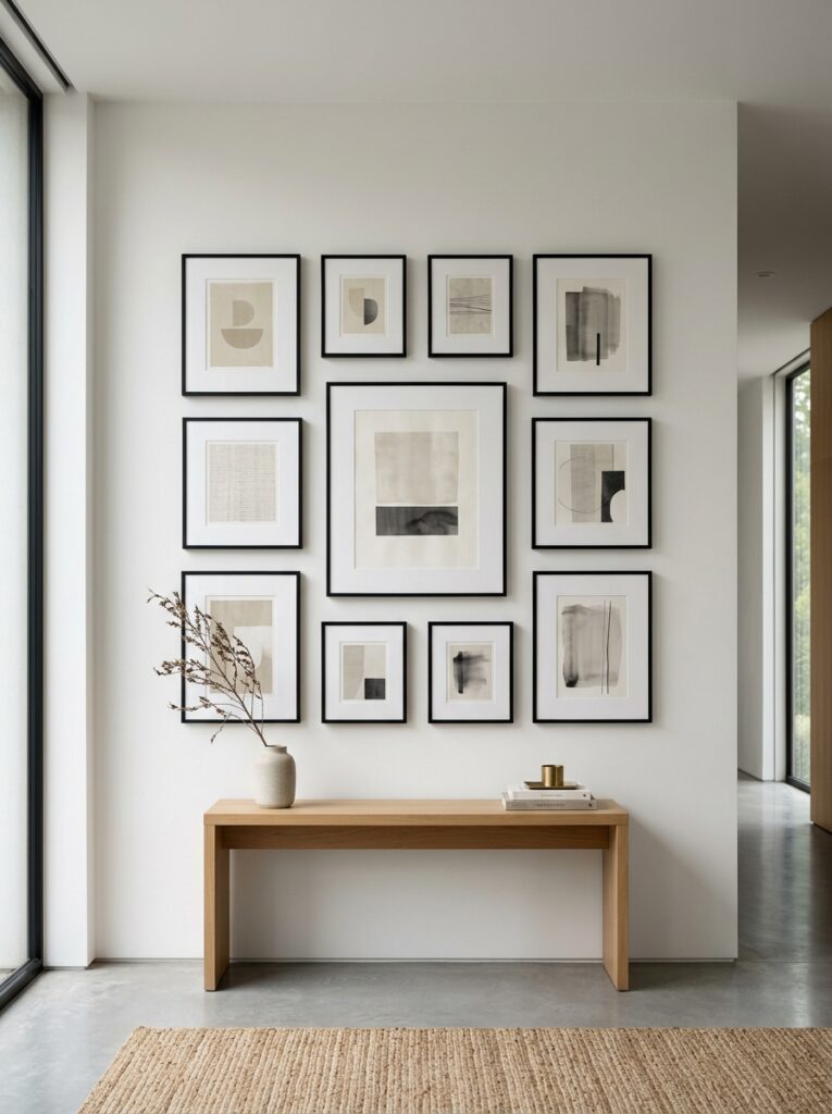
Large Center Anchor Art With Small Balance Frames
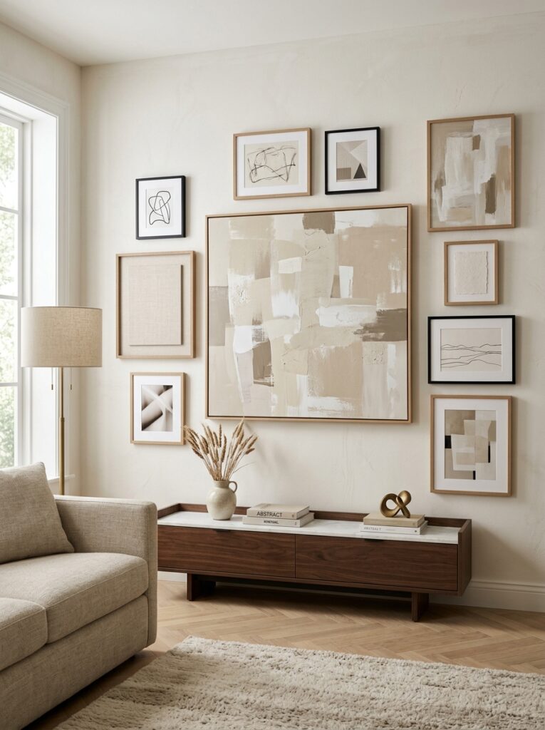
A single large central artwork anchors the wall, with smaller supporting frames placed asymmetrically around it. This hierarchy creates balance without strict symmetry. It feels designer because it mimics curated art gallery curation principles.
Floor-to-Ceiling Vertical Gallery Wall
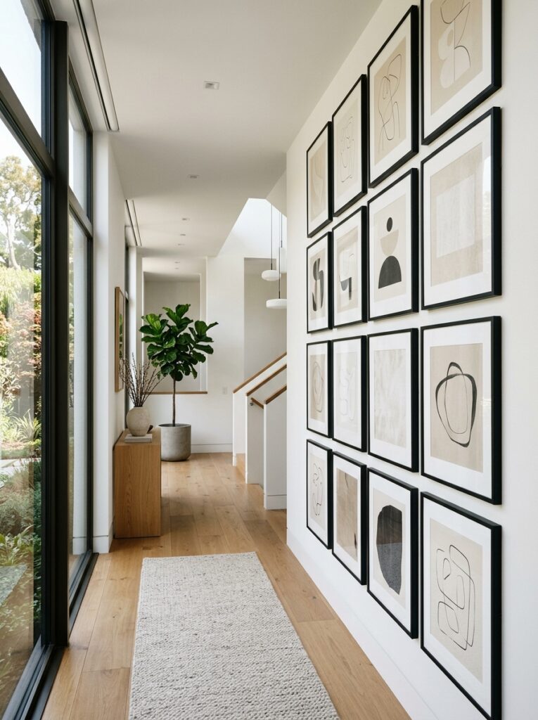
A vertical gallery wall extends artwork from floor to ceiling, using consistent spacing and frame alignment. The vertical flow emphasizes height without cluttering width. This works well in narrow spaces or staircases where upward movement enhances architecture.
Led-Backlit Art Display Wall
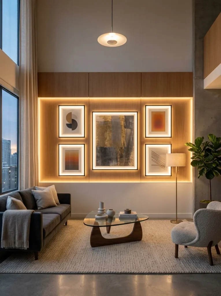
Soft LED backlighting behind frames creates depth and separation from the wall. This technique reduces visual heaviness and adds a floating effect. It feels premium because lighting becomes part of the art presentation itself.
Black & White Photography Gallery Wall
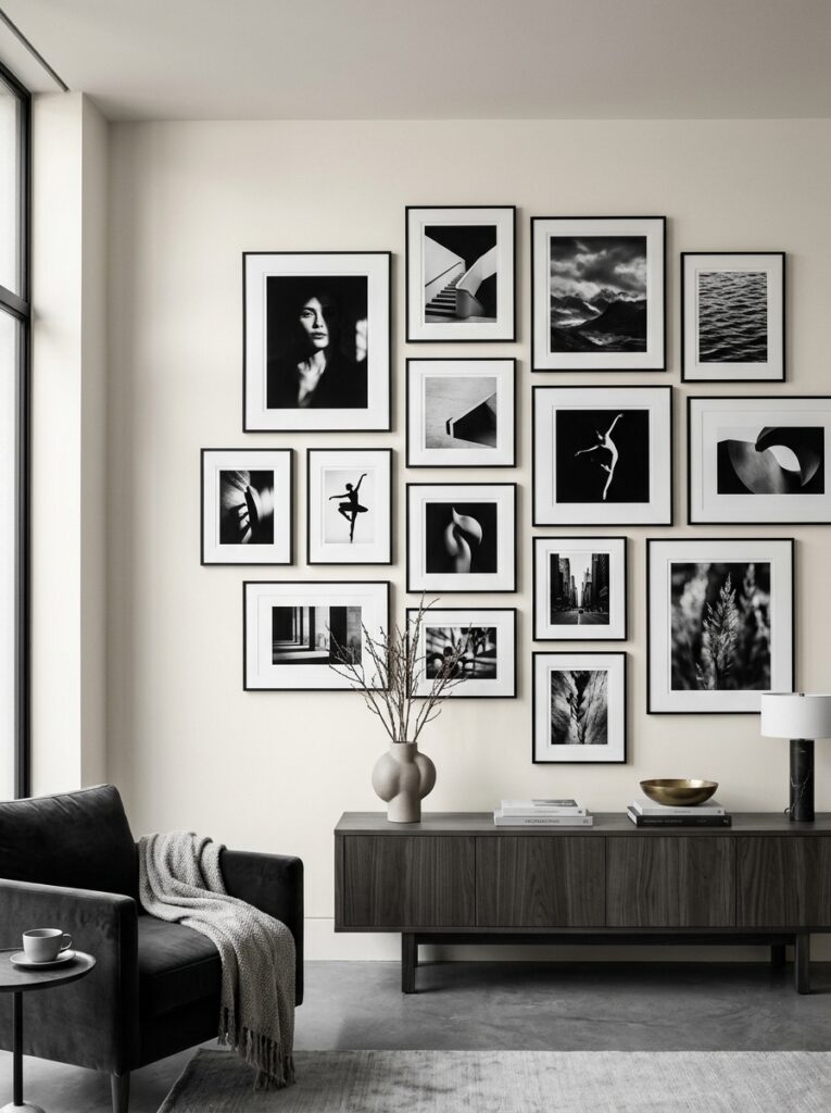
Black and white photography ensures visual consistency even with multiple frames. The lack of color reduces noise and creates emotional cohesion. This design works because tonal uniformity replaces color harmony.
Asymmetrical Spaced Gallery Wall
An asymmetrical layout with intentional spacing creates a relaxed but curated feel. The key is controlled randomness—frames vary slightly but maintain visual rhythm. This prevents rigidity while avoiding clutter.
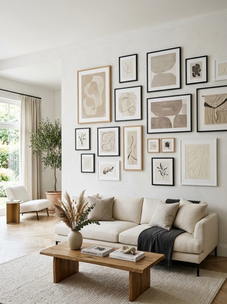
Earth Tone Abstract Art Wall
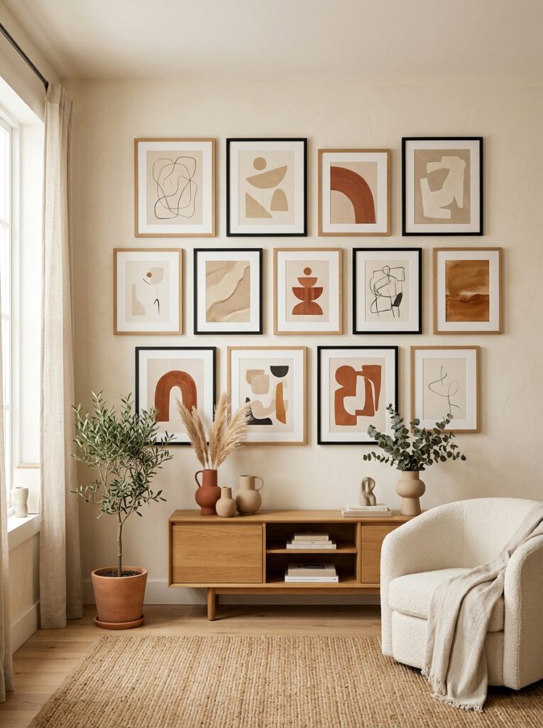
Using only earth-tone abstract art ensures cohesion across multiple frames. Shades of beige, terracotta, and muted brown blend naturally. This design feels grounded because the palette itself acts as the unifying element.
Thin Black Line Frame Gallery Wall
Ultra-thin black frames create structure without visual weight. The delicate outlines keep focus on the artwork while maintaining clarity. This design works because minimal framing reduces distraction significantly.
Shelf + Frame Mixed Gallery Wall
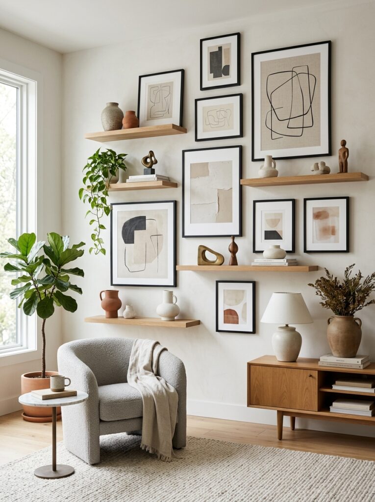
Combining framed art with shelves breaks visual repetition. Objects, books, and sculptures introduce variation while maintaining structure. This design works because layering creates depth without overcrowding.
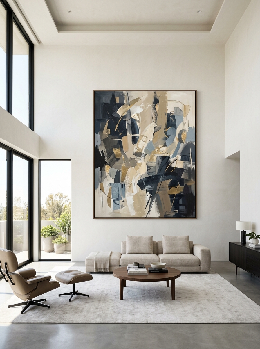
Oversized Single Statement Gallery Wall
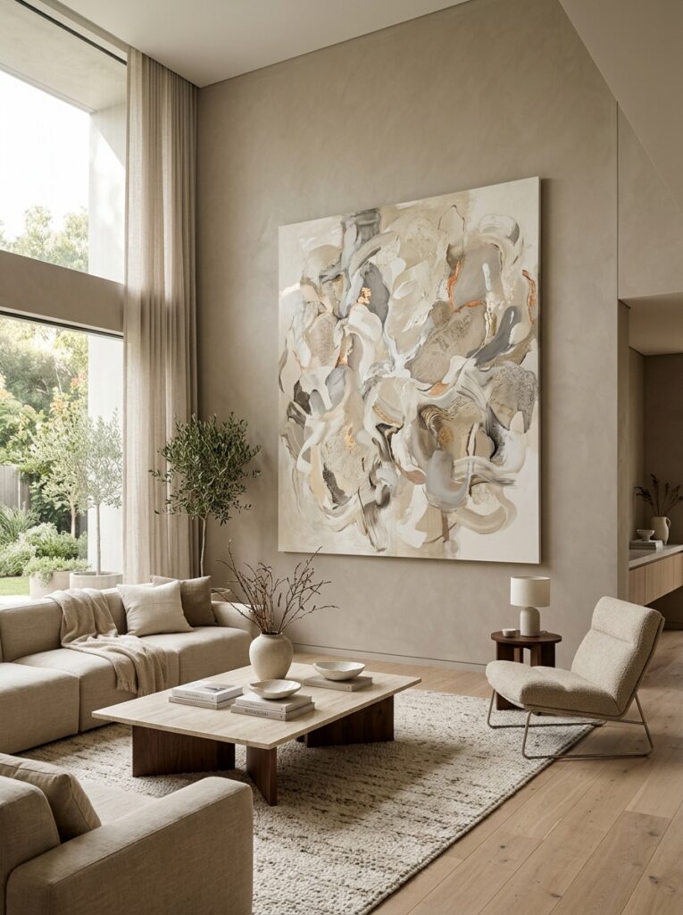
One oversized artwork replaces multiple frames entirely. This eliminates clutter completely while maintaining gallery presence. It feels powerful because simplicity becomes the focal point.
Soft Beige Frame Uniform Gallery Wall
Using identical beige frames across all artworks creates soft cohesion. The subtle tone-on-tone effect reduces contrast, making even multiple frames feel calm and unified.
Staircase Flowing Gallery Wall
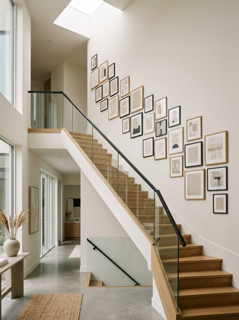
Frames follow the diagonal movement of a staircase, creating visual flow. Spacing remains consistent while alignment shifts gradually. This design feels dynamic because it interacts with architecture.
Sculptural Mixed Material Gallery Wall
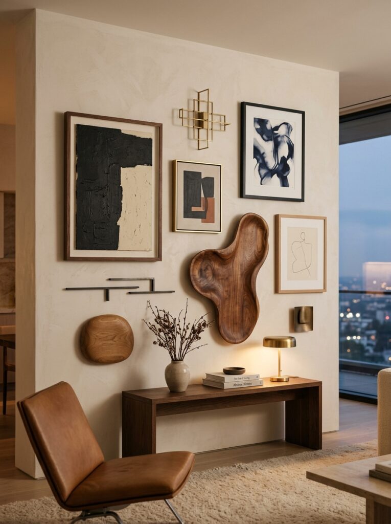
Combining frames with sculptural wall elements adds depth. Materials like wood, metal, and stone break flatness. This design feels architectural rather than decorative.
Soft Shadow Spaced Gallery Wall
Wide spacing between frames allows shadows to become part of the design. Light interaction creates rhythm without adding visual weight. This feels clean and breathable.
Neutral Gradient Art Gallery Wall
Art arranged in a soft tonal gradient from light to dark creates visual flow. The progression feels intentional and calming. This design works because color transition replaces random placement.
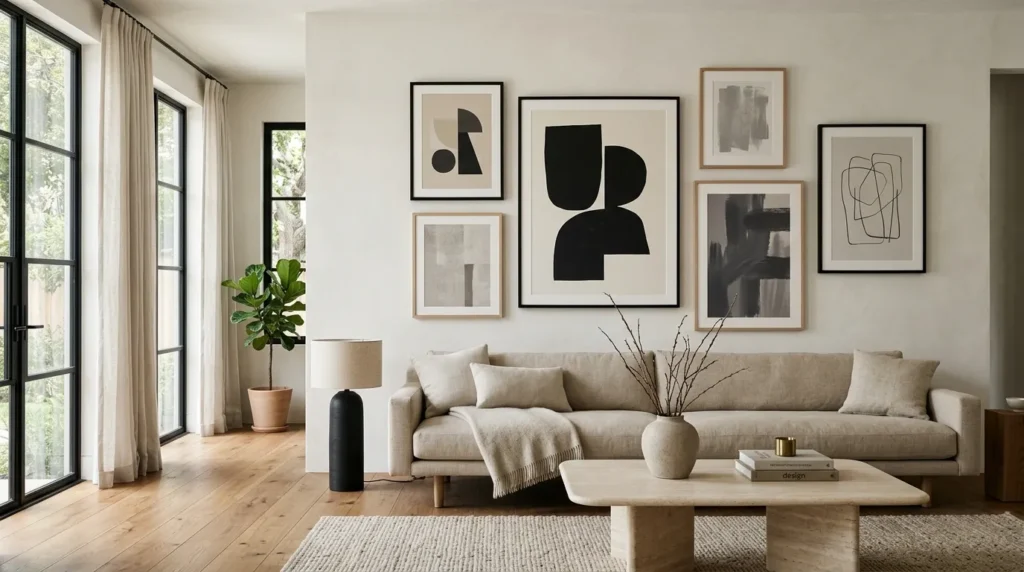
Framed Canvas + Empty Space Balance Wall
Strategic use of empty wall space makes framed art feel more important. Instead of filling the wall, this design emphasizes restraint. It feels expensive because negative space is treated as design material.